New in store: Japanese art colours
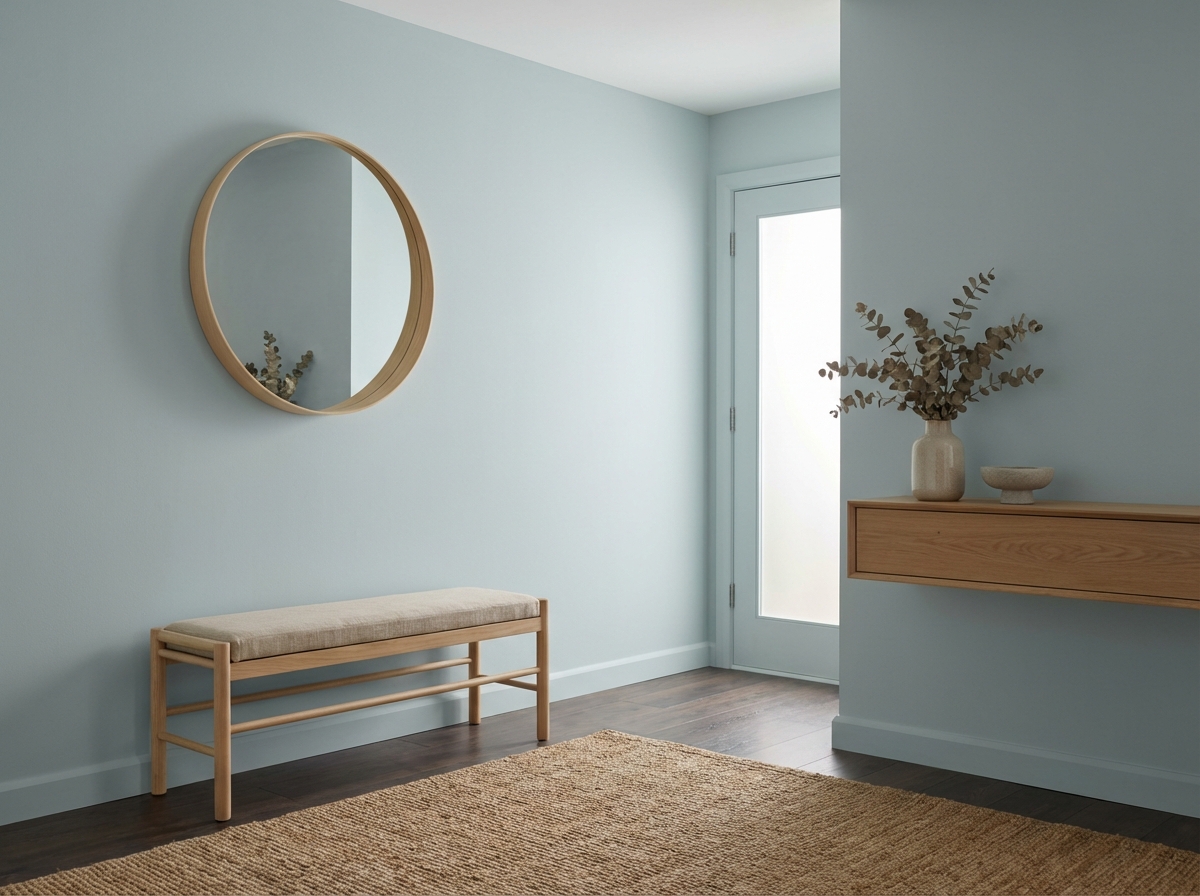
Early Dew X Dove Feather Grey
Early Dew, our soft, muted green shade, remains one of the most popular colours. And it's easy to see why: this tone radiates calmness, freshness, and understated elegance. In short: the colour blends seamlessy into a variety of interior styles.
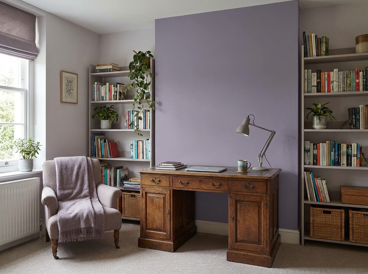
What makes Early Dew even more special is its complementary relationship with the Japanese colour Dove Feather Grey. This grey-purple adds a subtle depth and balances the soft green of Early Dew. Together, they create a calm, harmonious look with plenty of character. For the Japanese colour Dove Feather Grey, we offer the closest RAL equivalent : RAL 4009.


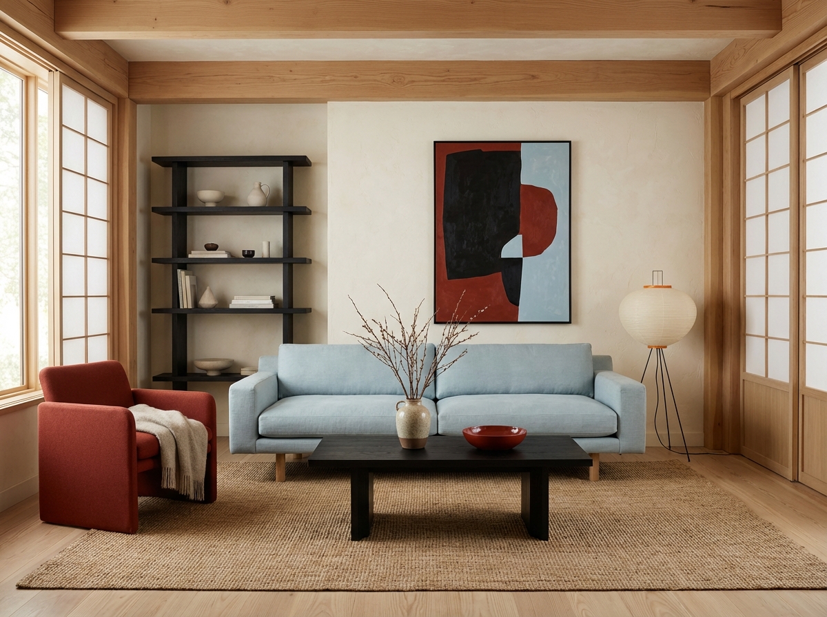
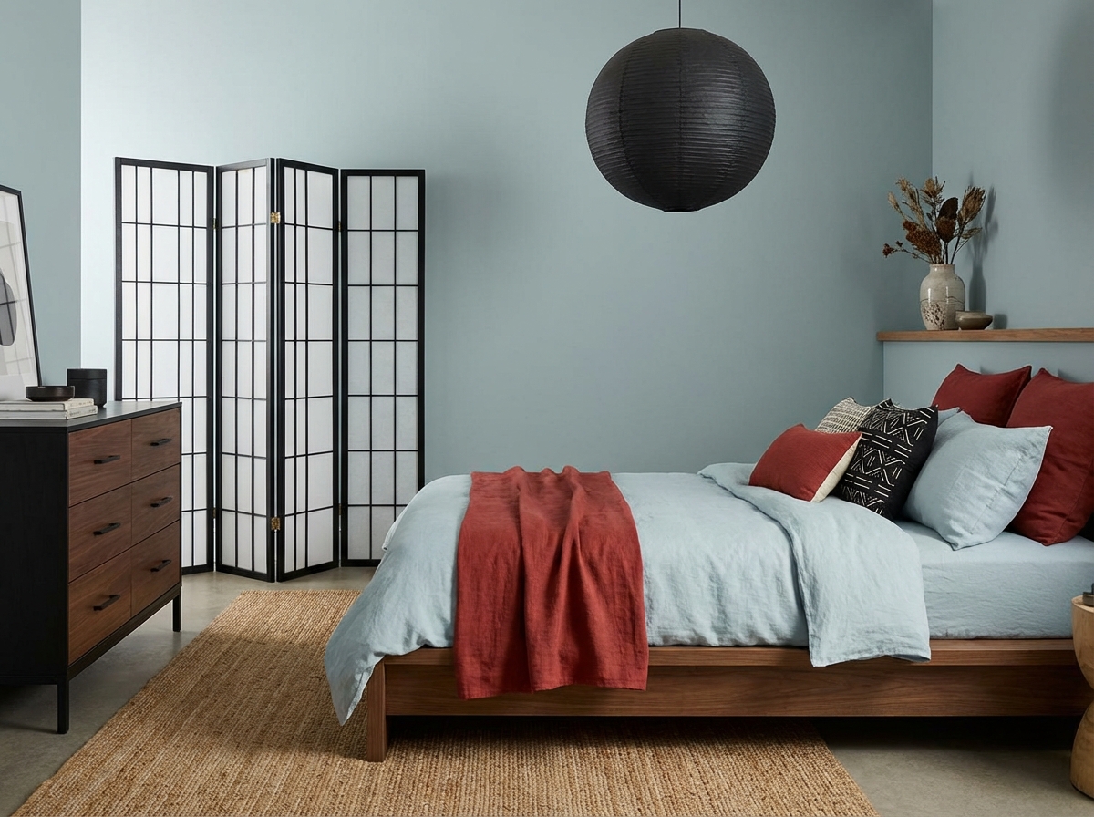
Black X Jasper Red X Pale King's Blue
The Japanese colour trio Black, Jasper Red, and Pale King’s Blue is described in The Dictionary of Colours as a set of three complementary colours.
Together, these these colours create a balanced palette in which contrast and harmony naturally support each other. In Japanese colour tradition, the focus is not on bold combinations, but on balance and nuance. The deep, warm black forms a stable foundation, adding depth and calm. Jasper Red introduces a grounded energy, evoking nature and craftsmanship. Pale King’s Blue acts as a counterweight: light, refined and softly greyed, giving the palette a sense of air and serenity.
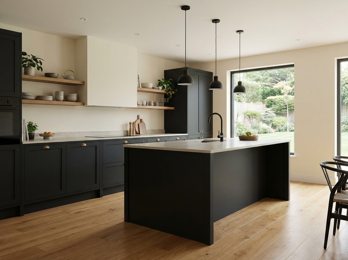
In Japanese colour tradition, black is not a harsh or cold shade, but a deep, warm foundation that brings calm and structure. With its subtle earthy undertone, this black conveys restrained strength and refinement. It acts as an anchor within a palette: it frames, adds depth, and allows other colours to stand out more vividly. In interiors, black creates contrast without overpowering, highlighting simplicity, balance and timeless elegance. We can offer this colour in the similar shade Ink.
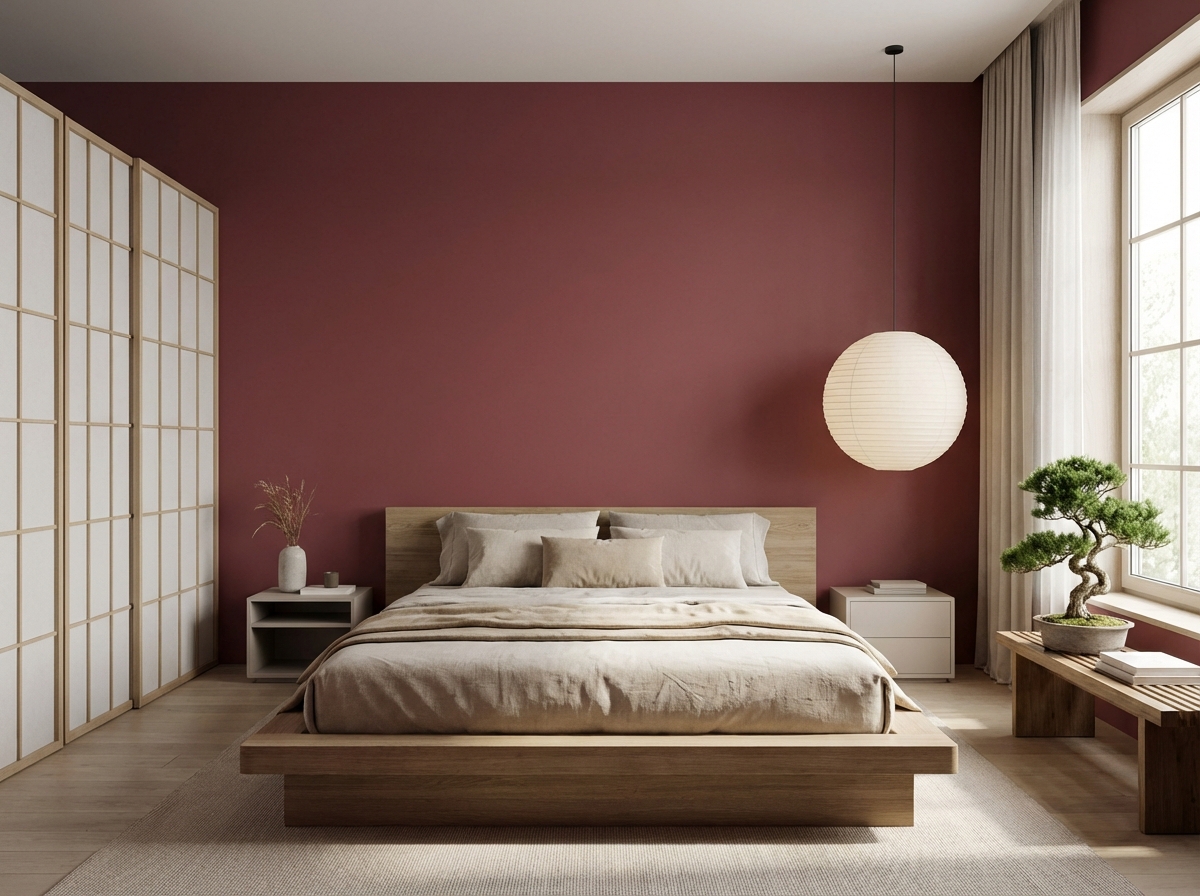
Jasper Red evokes heated earth and polished stone. This warm red carries a natural depth, feeling both grounded and quietly powerful. It adds weight and emotion to a space without disturbing its calm. The colour acts as a subtle focal point - tactile, present and rooted in reliability.
Pale King’s Blue is a light, refined blue with a soft, greyed undertone. It conveys calm and clarity, as if it filters light rather than reflects it. In other words, Pale King’s Blue brings a sense of space to an interior and acts as a counterpoint to warmer shades.
Blogs récents
Vous n'en avez pas assez des tendances en matière de peinture ? N'hésitez pas à consulter nos récents articles de blog pour découvrir d'autres tendances pour votre décoration d'intérieur.


